 Two years ago we took a family vacation to California and spent a few days at Disneyland and California Adventure. It was a great trip and although I made some of the layouts right after the trip, the rest lingered for a while and I just finished them last fall. Today I photographed the California Adventure album and added it to the gallery. This album was the first time that ever used one collection of supplies for an entire album. I've since done it in other albums, but it was a first for me then, and I had worried that the album would seen repetitive since I only had a limited number of papers and embellishments to use. While I wanted the album to have continuity, I did't want every page to look just like the last page.
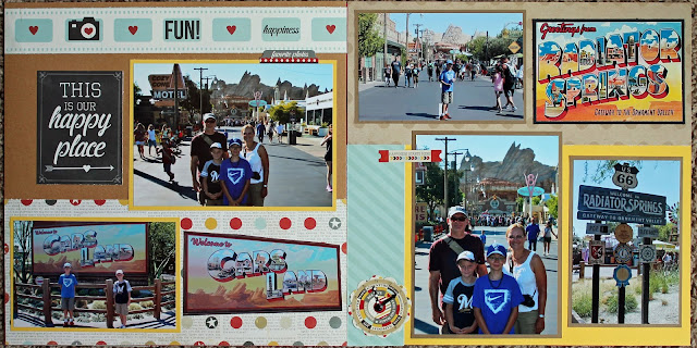
To try to break up the repetitiveness, I decided to focus on the color scheme and the colors that I accented different layouts with. For some areas of the park, I focused on bright primary colors and used those for background and accent papers:
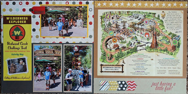
For other lands in the park, I focused on the earth tones and lighter shades in the collection, the browns and greys, to give it a different feel:
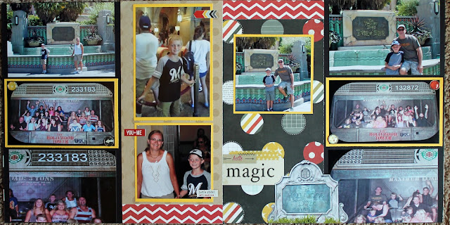
I also used black accent papers heavier in some layouts than others, in night time layouts or rides that were more serious and scary, like Tower or Terror:
It's a subtle difference I think, but I like it and like the idea of intentionally accenting different colors on different pages. Different shades can change the mood of our layout and when using a collection that limits your different patterned paper choices, using different solids can help keep the layouts from looking too repetitive. Although all of the layouts use the same patterned papers over and over, each layout is unique.
The full album is posted here if you want to check it out!


No comments:
Post a Comment