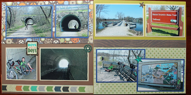
The papers on these layouts are a combination of papers from the Paper Studios "Murphy's Square" collection mixed with one sheet of paper with trees on it, and one sheet with gears on it. Even though they were not a direct match to the other papers, they were a close enough match and I wanted to bring in a little bit of nature and a little bit of a biking theme into the pages.
I left the photos in chronological order to highlight the different things we saw along the way and the things we stopped to look at. Often I will shuffle the order of photos around to create the best use of space, but these all seemed to work in the order they were taken, so there wasn't too much shuffling. Here are the final 4 layouts:
Thanks for looking! For more mountain biking layouts please click here!


No comments:
Post a Comment