Wednesday, November 15, 2017

Zion National Park Scrapbook Cover Page

Last August our family took our annual National Parks vacation and this year we headed out to Utah. There are 5 national parks in Utah, as well as many other National Monuments, but the seeing "Mighty 5" was our goal: Arches, Canyonlands, Bryce Canyon, Capitol Reef, and Zion. Zion has been on our short list for a while now, and it did not disappoint. It was simply gorgeous.


I had a little bit of a hard time choosing a paper collection for these photos. I had previously purchased the We R Memory Keepers High Five collection, but wasn't sure about using it on these photos. The main colors are black, white, green, and yellow, and I wasn't sure that it would work the best with these photos - the rocks of Zion have so much deep red and brown in them, and I thought maybe I should use papers that highlight that?

But I loved the collection and I thought it had a bit of a southwestern vibe mixed with a bit of nature and that it could work. I was able to coordinate a bunch of other nature and outdoors themed papers with it so that I could mix and match, and have enough to do the full album.


For this cover page, I kept things fairly simple: a big bold heading, one large scenery photo, and one photo with a little more detail. And with a tag, some washi tape and a few embellishments, the page was complete.


This was my first time using washi tape and I have to say...I love it! I used it as a border to frame out the 5x7 photo, and used it again to frame out the title.


This was a fun layout to make and came together in less than 30 minutes. I think my favorite piece is the heading with the big block letters. 

Thanks for looking!

Wednesday, November 8, 2017

First Day of School - Last Day of School Scrapbook Page

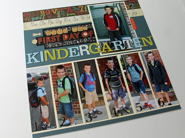
After completing the School Year Photos layout, I had fun idea for another collage type layout for my kids school years - a page for all of the first day of school photos. What began as an idea for just the first day of school photos turned into a First Day of School - Last Day of School 2-page layout, highlighting the first day of Kindergarten, and what will be the last day of High School.


First Day of School Year Photo Collage Scrapbook Page Layout

Again I had to go back and collect all of the first day of school photos. Thank goodness for digital technology and computers - they were all basically at my fingertips - just a few clicks away!

First Day of School Year Photo Collage Scrapbook Page Layout

After gathering the photos, I tried many variations of the layout before deciding on this one. My original idea was to have one long strip through the center of both pages with all of the school years, but I realized that 6 thin photos was the most I'd be able to squeeze in a 12x12, and I couldn't get the Kindergarten picture in. I considered just doing grades 1-12, but really wanted to keep the Kindergarten photo in. So I moved it to the top and realized I could balance it out on the other side with what will be a Last Day of High School photo. With that, the layout was set.

First Day of School Year Photo Collage Scrapbook Page Layout

To accent the photos, I added a border across the top of both pages - different borders but from the same paper collection and same color scheme. I created the labels with a black piece of cardstock and various colors of chipboard letters. I really wanted the words "Kindergarten" and "Highschool" to stand out, so I used a larger chipboard for them, and placed them running over the photo (the H is not yet attached, I'll need to put the photo under in first.) To label the yearly photos, I added transparent gel numbers to each photo - they are noticeable but yet subtle enough to not distract from the photo.

First Day of School Year Photo Collage Scrapbook Page Layout

It was so fun making this layout, even though it is a work in progress and not yet complete. Each year I'll just add one photo and 5 years from now it will be complete!

Thanks for looking and I hope you are inspired to make a few school year pages for your kids!

Tuesday, November 7, 2017

School Photos Collage - Through the Years Scrapbook Page

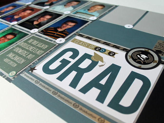
I recently started working on my kids school year albums again, and decided that I wanted to do a 2-page layout of their school photos. I've often seen those picture frames where you can add each year's photo into a collage, and so I wanted to do a scrapbook version of that.

School Year Photo Collage Scrapbook Page Layout


The first step was gathering up all of the photos of the same size from each year, this proved to be the most time consuming part of the process. I had some of the photos in the right size, but searched through 4 photo boxes to find a straggler here and there. With 2 still missing, I asked my husband if he still had any old school photos of the kids at work, and he did! The last 2 were found.

School Year Photo Collage Scrapbook Page Layout


From here I laid them out in various arrangements to see how the years would best be grouped or sequenced. I knew I wanted to add a large graduation photo as well, so I made that the highlight of the second page and arranged the small photos around it, with the 4 high school year photos above the graduation photo.  

School Year Photo Collage Scrapbook Page Layout


This layout was really quite simple - I chose a subtle pattern paper for the background of the collage page, and mounted each school photo on grey cardstock. I needed one filler square in which I added a journaling card with a nice quote on it.  


The Graduation embellishments came mostly from the Echo Park Grad kit, and one other graduation sticker sheer I had on hand. To add each grade, I printed out the numbers in a font that I liked, and punched them out with a 1/2" circle punch. And that was it! Here is the final layout.

School Year Photo Collage Scrapbook Page Layout

I'm happy to have this done, and I had the pleasure of making 2 of these, one for each of my boys albums. Now, all I have to do each year is add the photo. So easy.

After finished up these layouts, I came up with another school year layout which I am really excited to share tomorrow!

Monday, November 6, 2017

Creating Your Own Journaling Cards and Embellishments

If you've taken a look at any of my pages, you probably know that I tend to love journaling cards. Not always so much the journaling, but just the cards! I love cards with just graphics on them and especially love cards that give you enough room to write just a little bit, but not a whole novel.

I recently tried my hand at making some of my own journaling cards, and was quite happy with how they turned out. I've been cleaning out my scrap paper lately and thought this might be a good way to use up some bits and pieces of various papers instead of just tossing them away.


The first set I decided to try was for a fishing themed set. I had an old set of fishing stickers, and matched together 4 different coordinating papers, 2 colors of cardstock, and went to work. I was able to create 5 3x4 journaling cards and 4 2x2 cards. In addition to the stickers, I stamped 3 designs and added them to the cards. I thought these turned out really nice, a little bit of a vintage look but able to coordinate with just about any lake or fishing papers.
 
 
For the next set, I tried using up a myriad of different leftover camping stickers, scrap paper and journal cards. I have a lot of miscellaneous camping paper scraps, sticker sheets with just a few stickers left on them, and leftover cards from other sets. Since they don't really coordinate with anything on their own, I coordinated them together.
 
 
Using all of these supplies and a few stamps, I was able to create a large, colorful set of cards and embellishments.  Plus it felt really good to put those old supplies to use and not just toss them in the garbage!
 
 
The last set I made are not so much journaling cards, but accents for any zoo, safari, hunting, or even hiking pages. By using a scrap of paper with tracks on it and cutting them apart, I mounted each of them on a coordinating background paper and then onto cardstock. I love these little prints, they will make cute accents to any number of pages.

I definitely learned not to let my scraps go to waste - I have always saved them but now I have something to do with them! 

Have you ever made your owen embellishments from scraps? Please share!

Friday, November 3, 2017

The Total Solar Eclipse Scrapbook Pages

Back in August my son and I made a spur-of-the-moment road trip to view the total solar eclipse. The closest place to us that would experience totality was St. Louis, so that's where we went. Once in St. Louis, we watched the eclipse at Jefferson Barracks Park in south St. Louis where they were hosting a large viewing party.

I could not wait to scrapbook these photos, and I had so much fun creating these pages. On these pages I included a small poster from the day, a small poster from the event we were at, and our actual eclipse glasses.


I had chosen to use the Simple Stories 24/7 collection for this album, since we stopped at several other sites in the area and on the way, and I had several other pages to make. I wanted to use one paper collection for them all, but also knew that I'd need something special for the eclipse. 


I was able to find one amazing sheet of moon paper showing the different phases of the moon. These phases look just like the eclipse phases and it was perfect. (This paper is from We R Memory Keepers High Five collection and the paper is called Lunar.)


Once I had the black and white moon paper, I decided on the rest of the color scheme for these layouts - choosing yellow to highlight the sun photos, and a slate blue to accent, basically because I liked the look of it! Yellow and blue are always good together. I found a few patterned sheets in yellow and blue that were part of the 24/7 collection, and the patterns really worked for this.


For the actual eclipse photos, I had planned to do a collage but wasn't sure how many photos to include. I had taken photos that day using my DSLR and shooting through the solar eclipse glasses that I had. (Yes it work's but they come out a bit hazy, but it's better than nothing.) So I chose 10 of the best ones, attempting to show the different phases of the eclipse.


To accent the collage, I added pieces of the patterned papers that I used earlier, and added a couple of small and simple embellishments. I wanted to keep these pages very simple and let the photos stand out.

Here are the final 3 2-page layouts together:


Scrapping these photos was so different from what I'm used to working on and it felt great to do something a little different.

Thanks for looking! If you scrapbooked the eclipse - please share your pages with me, I'd love to see them!

Wednesday, November 1, 2017

Quick and Easy Collage Cover Page for St. Louis Road Trip

Yesterday I began working on a few photos from a quick road trip my son and I took in August to see the total solar eclipse. We drove to St. Louis, stayed overnight, and saw the eclipse the next day. I had chosen to use the Simple Stories 24/7 collection for these photos since I liked the look of it and color scheme, and it was a set of supplies I had on hand! One of the sheets included in the pack was a pre-printed photo collage. This page was perfect for a cover and ended up being one of the quickest and easiest covers I've made. Since the page already had the frames and inset patterns, all I really needed to do was add a few photos, a couple of tags, and label them.


I chose one small photo for each of the places we visited, one additional photo of my son and I, and decided to use two frames for labeling our trip. I trimmed down the photos to fit and added some lined paper to one of the frames to add the journaling. 

Although the purpose of this trip was to see the eclipse, we stopped at several other places along the way, so I wanted to be sure to include those as well. But the highlight really was the eclipse. 


There were a few frames in which I didn't really like the graphic that was there, so I covered it with a cut-down journaling card or sticker over the top.

This layout took about 15 minutes and was really fun to make. I loved the clean and simple look of this page, and the idea of this mosaic-grid-collage style page inspired me to try to incorporate this look into the entire album.

Here is the final layout:

Thanks so much for looking!

Tuesday, September 26, 2017

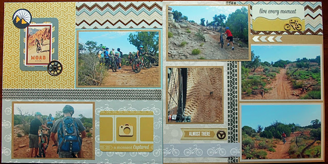
Mountain Biking in Moab Scrapbook Page

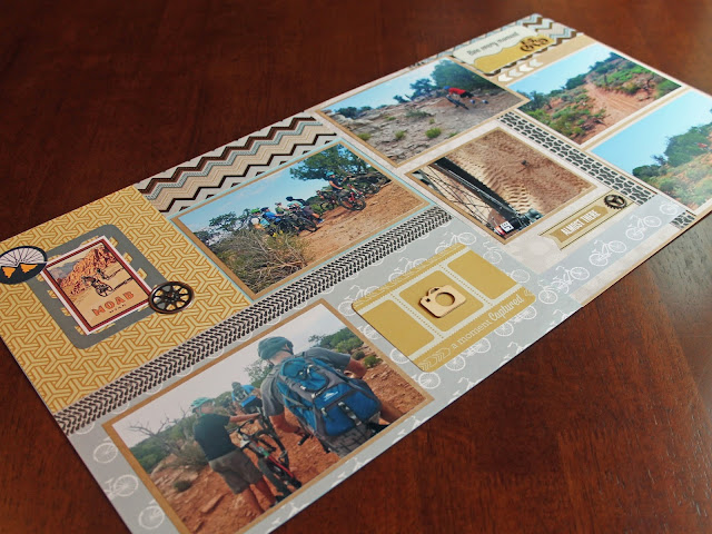
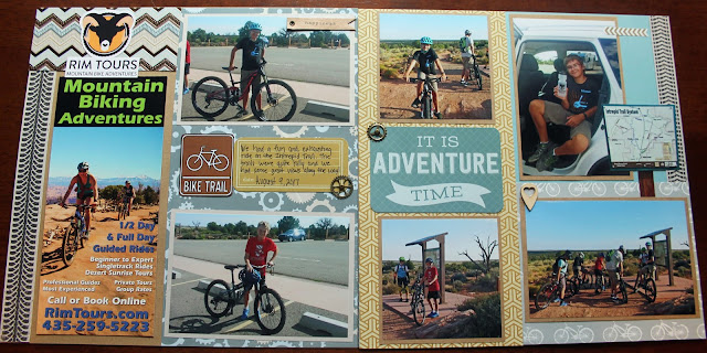
This summer we took a trip to Utah to visit their National Parks and Monuments, and while we were there we spent 3 days in Moab. Since we like to mountain bike, we thought it would be fun to try mountain biking there. So we booked a tour at Dead Horse Point State Park, whose trail system is well known out there for mountain biking. The trail was hard. A lot harder than we thought it would be. But it was quite the adventure and we did have fun. Although I wasn't able to stop often or take many photos on the trail since we were with a group, I was able to get a few good shots before and after the ride, and at one of the overlooks we stopped at.

Moab Mountain Biking Scrapbook Page Utah Dead Horse Point

Scrapping these photos was so much fun! I had been keeping an eye out for any biking themed papers or supplies for a while, and had picked up a few things that I wanted to use including some metal gears, wooden cut-outs and bike themed paper. I was able to find paper with bikes, gears, and tire tracks that fit the color scheme I wanted to use.

Moab Mountain Biking Scrapbook Page Utah Dead Horse Point
The pattern in the yellow paper reminded me of the inner spokes of a bike tire.
The color scheme I used on here - kraft, grey, blue, yellow, and white, I used throughout the Utah albums. I was able to mix and match papers that were not bike themed with those that were to keep the same feel as the rest of the layouts in the book. These layouts also have some black accents in the tire tracks.   

Moab Mountain Biking Scrapbook Page Utah Dead Horse Point

We stopped at one scenic overlook in the park where we were able to do some photos, which turned out really nice. Our tour guide even took family photos of us all together.

Moab Mountain Biking Scrapbook Page Utah Dead Horse Point

I tried to add the wooden and metal bike related accents where I could on the pages, and I was able to download a few Moab pieces of clip art and printed those out to use as well. I used several wooden cut-outs on these laytouts, which I haven't used a lot before. I wasn't really sure where to place them, but ended up layering some of them on journaling cards, and I really liked the look of that.

Moab Mountain Biking Scrapbook Page Utah Dead Horse Point

Here are the final layouts, thanks for looking!

Moab Mountain Biking Scrapbook Page Utah Dead Horse Point

Moab Mountain Biking Scrapbook Page Utah Dead Horse Point

Moab Mountain Biking Scrapbook Page Utah Dead Horse Point

Moab Mountain Biking Scrapbook Page Utah Dead Horse Point