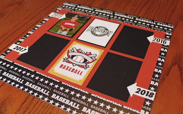
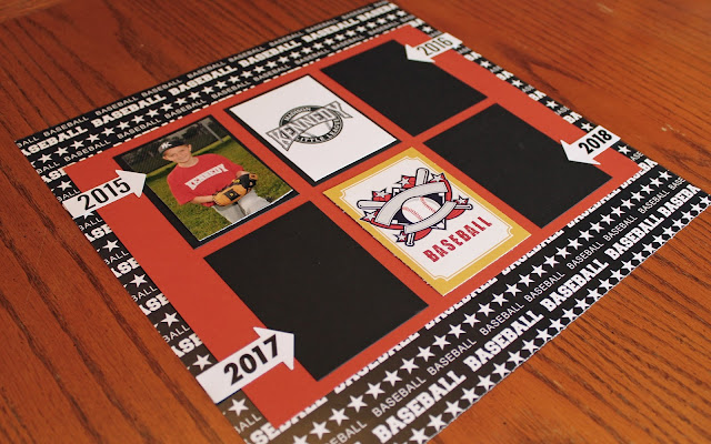
I started a new baseball album with photos from 2015 and forward since the other album is completely full. Since I already had the 2015 layouts completed, I just needed a cover page for the album.
Since I tend to make about 10 pages per season for baseball, I'm again assuming that I'll be able to get 4 seasons worth in this one album - or about 40 pages. That seems to be about the maximum number of pages I can comfortably get into a ring-bound album, so I'm going with it.
I also created the cover for the next soccer album. This album should hold 2 years worth of soccer (4 seasons with spring and fall, plus a few pages of indoor), so I've set up the cover page to have his current team and season, as well as his next years team and season.
This layout was again pretty simple - I double mounted the photo squares and added a few strips of soccer paper. I printed out the header banner with the logos, and added a row of soccer word stickers along the middle and bottom of the page. I had these large soccer brads that I had found on clearance at a local store, and thought they'd make a nice touch to the banners.
If feels good to "work ahead" a bit and have these pages done. I don't know why I never did cover pages for these albums before, I guess the albums were always a work-in-progress with new layouts being added each season. I never thought to do covers for them since they were always changing. With the albums now more permanent, all I need to do each year is add the layouts for that season and put a small photo on the cover page. This should make it easier to stay caught up!


I'm on the fence about this, while more customization is good, I have a feeling this is a "in-progress" update, it just feels incomplete and half-way there.
ReplyDeleteWe use badge layout for apps on design approvals (visual projects), so the image being displayed is important. Old layout "feels like" it had larger images,
maybe because the images were cropped more loosely so it's easier to tell which project it was at quick glance. Now the image is cropped closer, making it
harder to scan thru at quick glance. I find myself needing to click into the project more often than usual. Which makes the whole user experience less
efficient.
I have a couple suggestions that might make it work better:
1. Increase the height of the window the cover image is being displayed.
2. Let us to choose which image to be displayed as "cover" (like how Pinterest handles cover images of each board, was hoping for this for a long time)
3. Let us adjust which part of the image to show and how tight or loose the crop is (with a fixed window, let us move the image around and maybe enlarge or
shrink it to control what shows thru the window. Pinterest does a limited form of this, which is very useful in making the cover image relevant)
4. Allow Cover Image to be ordered in different hierarchy (currently every element can be ordered differently except the Cover Image, it seems to be stuck
in the 2nd spot, would like the option to set it on another spot in the layout. This one seems like an easy fix, since you guys allow that for every other
element already)